Feeling on Cue
The pain of losing someone close to you is a beast of a thing. It aches, pierces, smacks, numbs, shocks, and absolutely, completely crushes. But the worst part for me is that it sneaks. I never quite know when sadness will be jostled enough to completely spill over the brim and paralyze me for a time.
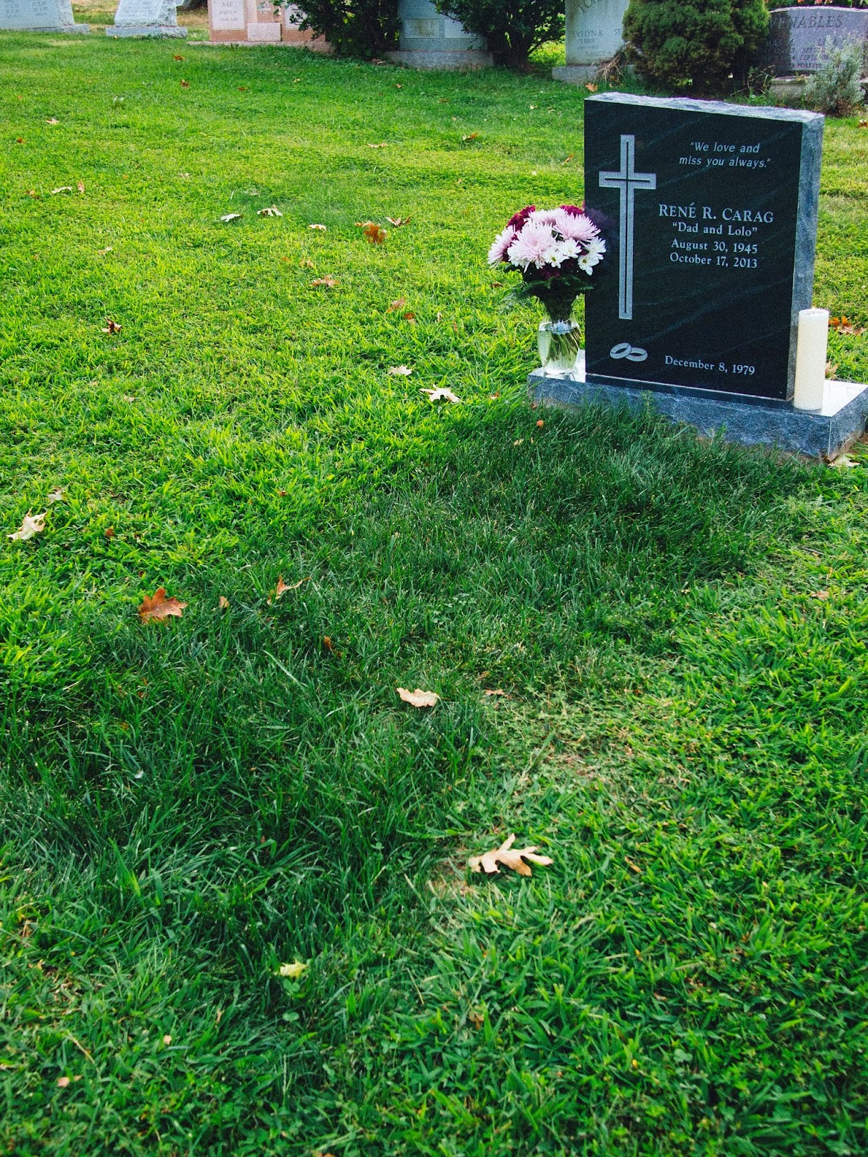
A year ago today, that which has been the dominant subject of my sparsely updated blog of late happened; my dad passed away. And even through the course of writing this post, I was a teary wreck for half of the first paragraph, and then stoic and nearly distracted from the topic the next. That I can’t completely control that can be hard to accept.
When I went home for what would have been my dad’s 69th birthday last August, I thought the brim would spill over right from the get-go — that the whole weekend would have been painful and cathartic. It wasn’t… I found enough distractions in being home, with family, my 9-month-old nephew, and the new bustle of fresh development in my hometown. There was a brand new commuter train station, surrounded by new malls in previously empty fields, and high rise apartments — black spires piercing a sky that had been clear blue and empty for generations. Even my old neighbor’s house was torn down, replaced, and a new young family moved in. There wasn’t much to allow sentimentality to take root during the short two days I was there.
I don’t know what I had in the way of expectations — probably very few of them at all. But I was hoping, after a difficult week leading up to it, that the weekend would be emotional. And when it still wasn’t, leading up to returning to New York, I was frustrated. I was reminded that the triggers for my sadness are often unpredictable. I can’t just plan to emote in a certain way at a certain time — humans don’t work that way, least of all me. Sometimes the right song will catch me in just the right way. A second listen may sound completely bland, instead.
In the time since, I’ve had my moments — some made sense, others didn’t. I realize in general that I need to achieve a certain level of isolation from the world — I’m sure meditation would be effective for controlling this were I to learn it. But the most important learning, that I constantly have to repeat to myself, is to allow the moments to happen, as best I can wherever and whenever I am. And maybe even more importantly for me, to allow them to not happen if they just aren’t going to. The problem I have with not emoting in the way I want to is a tendency to try to force it, and instead being left with numbness. And that’s worse territory to be in. Not being hard on myself and trying to force it is a skill I’m learning very slowly, but it might be the most important one to learn.
Anyway, I don’t have much more to say about this, and I’ve been a bit rambling anyway. But it was also satisfyingly cathartic after all. So at least I have that. Thanks for reading!
Miss you, Dad. I’m grateful for the growth I’ve experienced in the year since you left us. I’ve apparently got a lot of growth left to do.
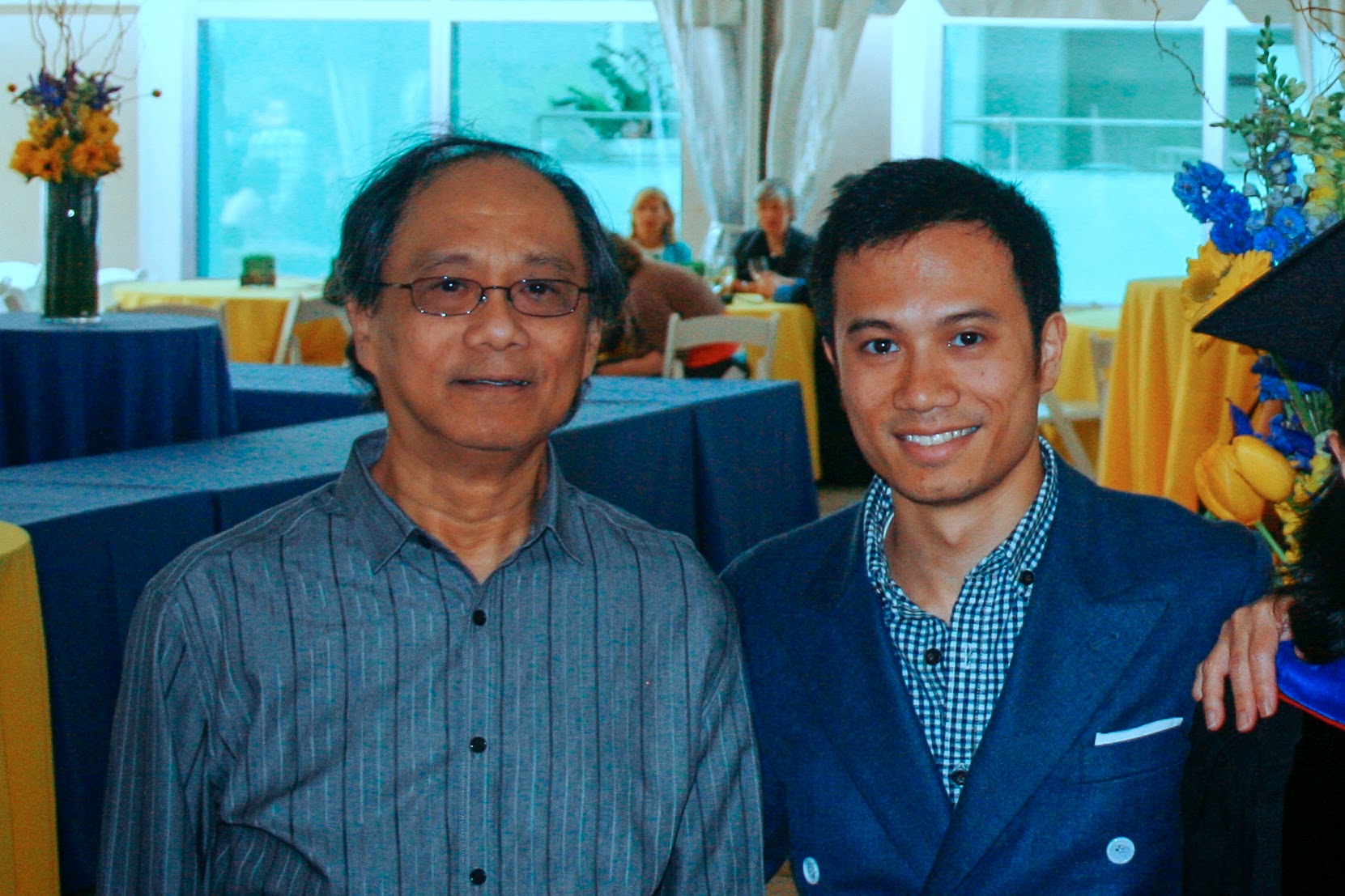
Lessons from Dad: The Crab Feast
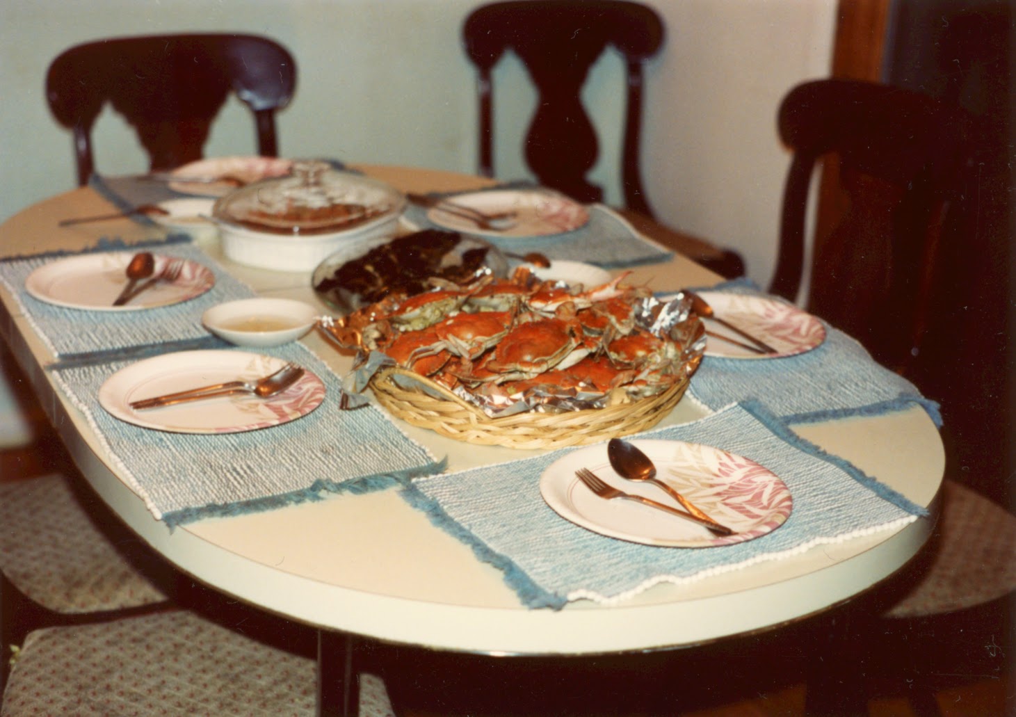
It’s my father’s birthday, the first since his passing last October. My mind’s been on him a lot lately, so I figured I’d write my next few posts about my and others’ memories of him. Here’s the first of those, from the cobwebbed archives of my brain.
Migrating Away from GitHub Pages and Changing Task Runners (just ‘cause)
I’m changing my workflow again! Partly because the nature of my recent work — quickly spinning together apps and prototypes one after another — has gotten me interested in workflow options more than ever before. But also partly because my last change — to Wintersmith from Jekyll — was already somewhat dissatisfying and behind the times. I’m talking about two things here: hosting on GitHub Pages, and using Grunt as my taskrunner.
When nostalgia hurts
I’ve always loved taking the Northeast Corridor Amtrak between Penn Station in New York and Union Station in DC. The trips served as time capsules, cutting through slow-moving, rarely-touched industrial parks, vine-encrusted warehousing, and humble mid-century exurbs. The sheer contrast with what I’m used to from either the destination or the origin made it easy to mentally escape via the view out the window.