Migrating Away from GitHub Pages and Changing Task Runners (just ‘cause)
I’m changing my workflow again! Partly because the nature of my recent work — quickly spinning together apps and prototypes one after another — has gotten me interested in workflow options more than ever before. But also partly because my last change — to Wintersmith from Jekyll — was already somewhat dissatisfying and behind the times. I’m talking about two things here: hosting on GitHub Pages, and using Grunt as my taskrunner.
Migrating my Blog’s Content to Wintersmith
I know now that it takes an inordinate amount of effort for me to consistently update this blog. It’s not for want of content, but rather a problem of editing. To jump-start my stalled blogging in a sort of meta way, I’ve decided to migrate my blog from tried-and-true Jekyll to Node.js-based Wintersmith. Because what’s better to blog about than the blog itself? (The answer’s “a lot of things,” and I promise to get to those later, but this’ll be interesting, too.)
Jekyll Plugins in Github Pages
I thought it was high time I made some effort in cleaning up and streamlining my post composition workflow, while riding the wave of my small redesign).
Problem with CSS viewport units for width?
Getting some unexpected behavior when using viewport units (vw,
vh, vmin, and vmax) to size width in
Webkit browsers:
When elements have a fixed width set in a viewport unit, their parents no longer contain them properly in Webkit browsers.
Open the following in Chrome (tried version 26 stable, and 29 Canary) or Safari 6, and compare to Firefox (tried in version 20):
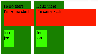
Here’s a screenshot of what that looks like in Chrome 26:
Here’s the same thing in Firefox 20:
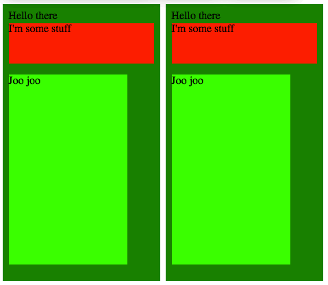
What I’d expect is the Firefox case, where the dark green parent element properly stretches to fit the width of its content (in this case, the child elements with fixed viewport-unit widths).
What do you think? A real bug? Certainly, one of them is wrong, and I’m
pretty sure it’s Webkit, since the behavior with other types of units
(px, em, rem, etc.) is like the Firefox
screenshot. I’ll have to check it out in IE10, which supports viewport
units as well, according to
Can I Use.
Additionally, it looks like there’s weirdness in the height, considering the lime green box in the Firefox screenshot is so much taller. Probably a difference in what each browser is considering the viewport. I’ll investigate that further.