Problem with CSS viewport units for width?
Getting some unexpected behavior when using viewport units (vw,
vh, vmin, and vmax) to size width in
Webkit browsers:
When elements have a fixed width set in a viewport unit, their parents no longer contain them properly in Webkit browsers.
Open the following in Chrome (tried version 26 stable, and 29 Canary) or Safari 6, and compare to Firefox (tried in version 20):
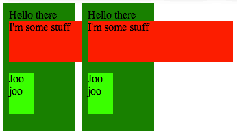
Here’s a screenshot of what that looks like in Chrome 26:
Here’s the same thing in Firefox 20:
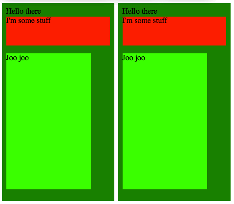
What I’d expect is the Firefox case, where the dark green parent element properly stretches to fit the width of its content (in this case, the child elements with fixed viewport-unit widths).
What do you think? A real bug? Certainly, one of them is wrong, and I’m
pretty sure it’s Webkit, since the behavior with other types of units
(px, em, rem, etc.) is like the Firefox
screenshot. I’ll have to check it out in IE10, which supports viewport
units as well, according to
Can I Use.
Additionally, it looks like there’s weirdness in the height, considering the lime green box in the Firefox screenshot is so much taller. Probably a difference in what each browser is considering the viewport. I’ll investigate that further.