Futzing Around with Icon Fonts and SVG
Vector graphics are great. They deserve more of a place on websites than they get — certainly compared to their rasterized cousins. Nowhere is this more true than with icon UI. I decided to dip my toes into two leading solutions to bringing vectors to webpages: icon fonts, and SVG.
I won’t go too much into detail on either icon fonts or SVG, the former of which has seen terrific coverage by the likes of CSS-Tricks and Web Designer Depot, and the latter of which has been a web standard since 2001. I’ll summarize with the normal wins of vector graphics: they are scalable and styleable, unlike raster graphics which need to be duplicated for every situation whether it’s a color or size change or both.
Using Icon Fonts
I’m using icon fonts for some UI in my footer — the links to my RSS feed,
my Twitter page, and my Github repository for this blog. There were certain use
cases that made icon fonts a good fit: specifically, I wanted to handle them
with CSS-driven text-shadows and transitions, just
like my plain-text links. CSS is a terrifically convenient layer at which to
style font icons.
The custom font I’m using comes courtesy of the awesome
Keyamoon’s IcoMoon, which
provides 300 free icons, and 622+ icons at the bargain price of $35. You can
also import custom SVG icons, if none of the free ones are usable, and you can
explicitly map your icons to Unicode characters. I let IcoMoon decide the
mappings for me, and soon enough had a perfectly usable stack of web fonts and
some nice CSS style definitions for using them, similar to the output of
Font Squirrel’s
Font-Face Generator. For the most part, I used IcoMoon’s generated CSS with
few customizations. It creates some nice classes leveraging :before
pseudo-elements:
/ Add the following classes to your stylesheet if you
   want to use data attributes for inserting your icons /
.iconb:before, .icona:after {
  font-family: ‘IcoMoon’;
  content: attr(data-icon);
}

/ Add the following CSS properties to your stylesheet
   if you want to have a class per icon /
[class^=”icon-“]:before, [class*=” icon-“]:before {
  font-family: ‘IcoMoon’;
  font-style: normal;
}
.icon-feed:before {
  content: “\0061”;
}
Some Gotchas
If you’re super anal about pixel perfection, then you probably should leave vectors behind right now and go back to your Photoshops. But if you’re still curious, a few things to note.
Firstly, icon fonts are text. And, as we all know, that means cross-browser, cross-operating-system rendering differences:
Chrome OS X, Firefox OS X, Chrome Windows, and Chrome Ubuntu 12. Bottom row zoomed 200%.
Pixel peepers will note the extra definition of edges of the tentacles in the non-OS X operating systems, and differently sized eyes, amongst other tiny differences. As a user of icons, you shouldn’t get worked up about this (though, if I had to pick a favorite, it’s the Ubuntu version, which lacks jaggies but retains nice detail).
If you’re creating these icons, then be aware of how browsers can smudge things away before you go to town on details. Pick a minimum pixel size you’re willing to accommodate, and make sure your details are chunky enough at that resolution; eg, hairlines should be thick enough to fill a single pixel at your minimum size; below that, they’ll get fuzzed away.
Next, be ready to tweak font-size and vertical-align
to get your icons to orient properly — especially when next to each
other or next to text. Just like normal letterforms, font icons deserve some
careful treatment so that their visual relationships (mostly size
related) to each other work well. But barring that, you’ll spend some
time tweaking specific alignment and sizes for each use case (note that the
below is SCSS):
.icon-feed {
  vertical-align: middle;

  .special-module > & {
    font-size: 1.7em;
    vertical-align: -.3em;
  }
}
font-size (white) and with tweaked
vertical-align and font-size to achieve better
proportions (red).
Thanks to CSS, this isn’t a big deal. Naturally, this is more pronounced
of an issue if your icons are inline with plain text, where most certainly
you’ll need to shift vertical-align explicitly for each icon
depending on the situation; however, in fairness, all of this needs to happen
with raster image icons, as well.
All of these gripes, in my opinion, are solidly overruled by the benefits of
being able to scale(), change color and
opacity, animate, and transition using
CSS — none of which you can do with a single raster image icon (well,
unless you don’t care about pixellation).
SVG
SVG, or Scalable Vector Graphics, is a really mature graphics standard that I have little experience with in a web context (though I have a lot of experience with vector drawing programs that happen to save as SVG). Because of the breadth of the standard, it’s well equipped for many things a vector in an icon font isn’t — namely, full-blown vector illustrations with many colors, gradients, opacities, strokes, what-have-you. Most of those things don’t apply to icons. But if ever you need more than one color in your icon, fonts won’t cut it, and you’ll have to use something like SVG.
That was the case with the Minefold logo that I wanted to add to my bottom links. There’s a second color that is fairly necessary for the identity. Perfect opportunity to try out SVG. So I cracked open Inkscape for the first time in years, traced out the logo, and saved it as “Plain SVG.”
The resulting SVG file is basically markup that I copied and pasted straight into my HTML. I shaved out a few assorted meta tags that Inkscape adds that aren’t necessary, but for the most part, it worked well:
<svg
   xmlns:dc=”http://purl.org/dc/elements/1.1/“
   xmlns:cc=”http://creativecommons.org/ns#“
   xmlns:rdf=”http://www.w3.org/1999/02/22-rdf-syntax-ns#“
   xmlns:svg=”http://www.w3.org/2000/svg“
   xmlns=”http://www.w3.org/2000/svg“
   version=”1.1” width=”71.25” height=”60.375” id=”svg3087”>
  <defs id=”defs3091”>
    <filter x=”-0.25” y=”-0.25” width=”1.5” height=”1.5”
       color-interpolation-filters=”sRGB” id=”filter4802”>
      <feGaussianBlur result=”blur” stdDeviation=”2.5” in=”SourceAlpha”
         id=”feGaussianBlur4804” />
      <feColorMatrix
         values=”1 0 0 0 0 0 1 0 0 0 0 0 1 0 0 0 0 0 1 0 “
         type=”matrix” result=”bluralpha” id=”feColorMatrix4806” />
      <feOffset result=”offsetBlur” dy=”3” dx=”0” in=”bluralpha”
         id=”feOffset4808” />
      <feMerge id=”feMerge4810”>
        <feMergeNode in=”offsetBlur” id=”feMergeNode4812” />
        <feMergeNode in=”SourceGraphic” id=”feMergeNode4814” />
      </feMerge>
    </filter>
  </defs>
  <path
     d=”m 22.5,10.0625 -10.625,6.046875 0,34.203125 10.625,0 0,-21.609375 7.515625,8.890625 0.09375,0 11.03125,0 0.09375,0 7.53125,-8.9375 0,21.65625 10.609375,0 0,-34.203125 L 48.765625,10.0625 35.625,29.453125 22.5,10.0625 z”
     id=”path3969” class=”logo-face-shadow”
     style=”fill:#074676;fill-opacity:1;stroke:none;filter:url(#filter4802)” />
  <path
     d=”m 48.758258,47.406249 10.617442,0 0,-34.198033 -10.617442,-6.049471 z”
     id=”path3867” class=”logo-face-dark”
     style=”fill-opacity:1;stroke:none” />
  <path
     d=”m 22.501432,7.158745 18.642249,27.531268 -11.111274,0 L 11.91486,13.208216 z”
     id=”path4881” class=”logo-face-dark”
     style=”fill-opacity:1;stroke:none” />
  <path
     d=”m 48.758258,7.158745 -18.642249,27.531268 11.111274,0 18.117547,-21.481797 z”
     id=”path3921” class=”logo-face-light”
     style=”fill-opacity:1;stroke:none” />
  <path
     d=”m 22.492439,47.406249 -10.617439,0 0,-34.198033 10.617439,-6.049471 z”
     id=”path3915” class=”logo-face-light”
     style=”fill-opacity:1;stroke:none” />
</svg>
Challenges and Benefits of SVG
First thing about SVG is that if you care about pre-IE9, then either forget about it, or learn an abstraction library of some kind. (I recommend Raphael JS.) Barring that…
SVG, as its name suggests, scales fairly well. However, it faces the same reduction issues as icon fonts. The solution is the same, though; don’t scale down an icon below its intended minimum size.
SVG does render much more consistently across browsers, at least so far as I can tell. Definitely a plus for the pixel OCD amongst us.
The main challenge is styling. CSS can’t be used in the same way that it is
for icon fonts (which are just text). In my case, the shadows and the bevel
effect, for instance, which are CSS text-shadows in the icon
fonts, actually need to be baked right into the SVG itself. Fortunately,
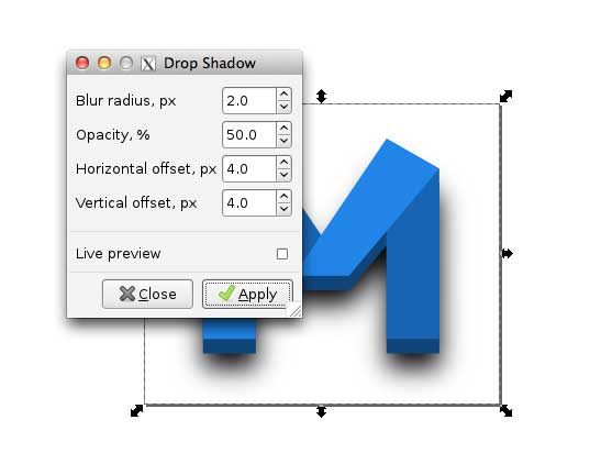
Inkscape has a pretty great “Drop Shadow” filter that makes creating the same
shadow effect in SVG quite simple. And the bevel is simply another
<path>.
If you are new to SVG drawing, though, this process isn’t very convenient. That’s one of the nice things about icon fonts — that they’re text, and can be styled that way, and you don’t necessarily need any special skills in vector drawing to accomplish certain effects.
Still, from a designer’s perspective, it’s great to have this level of explicit control. And obviously you can go much further than just icons.
That said, SVG is markup, and can be styled with CSS. Just note that the properties are different. For instance, SVG uses a different property for color: fill (versus text’s kinda’ misleading-in-comparison color property).
In the case of my icon, I wanted a hover interaction, which is slightly complicated as my icon is actually four separate <path> elements; since I want the entire icon to change color, I need to target all of these nodes explicitly. To do so, I added some classes to the <path>s to be able to hit them in CSS:
<!— Markup —>
<path
   d=”m 48.758258,47.406249 10.617442,0 0,-34.198033 -10.617442,-6.049471 z”
   class=”logo-face-dark”
   style=”fill-opacity:1;stroke:none” />
<path
   d=”m 22.501432,7.158745 18.642249,27.531268 -11.111274,0 L 11.91486,13.208216 z”
   class=”logo-face-dark”
   style=”fill-opacity:1;stroke:none” />
<path
   d=”m 48.758258,7.158745 -18.642249,27.531268 11.111274,0 18.117547,-21.481797 z”
   class=”logo-face-light”
   style=”fill-opacity:1;stroke:none” />
<path
   d=”m 22.492439,47.406249 -10.617439,0 0,-34.198033 10.617439,-6.049471 z”
   class=”logo-face-light”
   style=”fill-opacity:1;stroke:none” />

/ CSS /
.logo-face-dark { fill: #0a66ae; }
.logo-face-light { fill: #1087e1; }
And since I want all four elements to change color when any of them are hovered, I actually need to target a parent; conveniently, the <svg> element serves that purpose well (pardon the SCSS again):
svg:hover {
  .logo-face-dark { fill: #0a66ae + 100; }
  .logo-face-light { fill: #1087e1 + 100; }
}
One hiccup: I lose transition when in Chrome. Not sure why. But also not a huge deal (transition is one of those CSS3 properties that we should all be okay with degrading away). Though, this is probably a good reason to use script instead of CSS for interaction purposes in SVG.
Conclusion
To start with the obvious, while I was happy to pursue the combination as an experiment in my footer, I don’t suggest that anyone mix and match SVG and fonts for icons; for the sake of consistency, do one or the other.
I can see myself using SVG entirely at some point. I like the extra visual control and rendering consistency, and other simple things like, say, supporting more than one color at a time in a single drawing. I’ll need to spend some time digging into animating and transitioning interactions before I completely make the dive.
But for the vast majority of simple icon UI, it’s hard to argue against icon fonts. It’s pretty huge that they take on the very same style properties as text. @font-face is supported pretty widely at this point. There’s no question that they’re more convenient than rasterized icons and sprites, especially now that there’s great tools for creating them, like IcoMoon. For cross-browser, scalable, easily styled icons, they’re the way to go for now.