CSS Transparency and Overlapping Glyphs
rgba() is a supremely useful CSS value. But I noticed, while
working on the footer of this site down below, that operating systems render
typography using this value in interesting ways.
About CSS transparency
To start, a quick overview. rgba() is a CSS property value
specified in the CSS3
color module that allows one to set in single value the traditional
red/green/blue color sub-values, as well as a fourth sub-value for
alpha transparency.
The syntax is pretty straightforward: rgba(red,green,blue,alpha),
where red, green, and blue are specified either as a percentage (0 to 100%) or
as a number from 0 to 255, and alpha is specified as a decimal value — “1”
translating to 100% opaque, “.5” is 50% transparent, “0” is completely
transparent, etc.
The awesomeness of this idea is that with rgba() as a value, it
can be applied on any CSS property where color values are accepted, such as
color, background-color, text-shadow,
what-have-you. The end result is the ability to apply individual levels of
transparency to a single CSS selector for different properties — for instance,
you can set your background to one transparency, and your text to another.
Contrast this with the older opacity CSS property, which applies
an alpha transparency value (in the same 0 to 1 decimal scale) to the entire
selector — meaning, the selected element and any of its children would all
get the same opacity, background, text, and all.
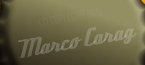
Rendering issues with overlapping glyphs
While tooling around with my footer down below, I noticed rgba()
being even more granular than I wanted it to be with regards to typefaces that
naturally had overlapping glyphs. I had my footer set to something like this:
  .myFooter {
    font-family: DeftoneStylusRegular;
    color: rgba(255,255,255,.2);
  }
Via @font-face, I’m using
Ray Larabie’s
Deftone Stylus, which is a retro styled script font that’s intentionally
kerned so that there’s overlap for the glyph connectors, as are most script
fonts. The above CSS would set the text’s color to be white with 20% opacity.
And the result looked like this:
Where the glyphs’ serifs overlap to act as connectors, the opacity is multiplied. I created a simple little test to try to isolate what the issue was:
    <style>
    .test{
      font: bold 5em sans-serif;
      color:(0,0,0,.25);
      letter-spacing: -.2em;
    }
    </style>

    <p class=”test”>This is a test using rgba.</p>
This uses the browser’s standard sans-serif typeface, sets it to black at 25%
opacity via rgba(), and condenses the glyphs via negative
letter-spacing to get overlap. It looks like this in Firefox 3.6 and
Chrome 5 in OS X:

As you can see, it appears as if each character is being targeted for transparency, and when they overlap they are treated as independent layers… in OS X, that is. Take a look at the same in Windows Firefox and Chrome:

In Windows, in either browser, it looks like it renders all the glyphs as a single vector object before then applying the transparency uniformly on the whole shebang. So my best guess is that browsers use OS-level compositing here, and there are discrepencies between operating systems. Most unfortunate, if you’re aiming for semi-transparent typography that has intentional glyph overlap. However, there’s a way out via opacity:
    <style>
    .test{
      font: bold 5em sans-serif;
      color: #000;
      letter-spacing: -.2em;
      opacity: .25;
    }
    </style>

    <p class=”test”>This is a test using opacity.</p>
This should actually look exactly the same as the first example — and that much is true in Windows. However, in OS X:

It looks just like Windows does — and actually, it looks the way I had
originally intended. And this makes sense, since according to
the spec regarding CSS
transparency, “…after the element (including its descendants) is
rendered into an RGBA offscreen image, the opacity setting specifies how to
blend the offscreen rendering into the current composite rendering.“ In
otherwords, render the elements at full opacity, and then crank the opacity
down post-rendering based on the opacity property value before
finally rendering on screen. Conceivably, rgba() is the same
thing, only with multiple layers nested across multiple properties — but
turns out OS X takes it a step further with text by isolating each glyph.
Check out this test page for the above examples (make sure to view in both Windows and OS X).
Conclusion
Honestly, this shouldn’t make a big difference in the vast majority of
situations where traditional sans-serif or serif fonts are in use, as their
glyphs don’t usually overlap. But think twice about it if you’re thinking
about applying transparency to text set using a font with intentional character
overlap — which includes just about all script fonts. Here’s an example of
just a few, including Deftone Stylus which I used in my footer — these are
at their default kerning, with no forced condensing via letter-spacing:
rgba() in favor of wrapping the text in
its own element, and then targeting that element with opacity,
instead. That’s exactly what I ended up doing for my footer, by the way. It
means extra DOM elements, but at least it works!
Note about Opera in Windows
In OS X, Opera 10.61 looks much the same as Firefox and Chrome. But in Windows, it has some issues with certain typefaces when transparency is used in any form:

As you can see, it’s cutting off certain glyphs along the vertical. Not sure what the issue is, but I haven’t hunted around much for answers, either, so I’ll update this if I find anything.
Credits
Thanks to the wonderful Font Squirrel and all of its participating typographers, for their wonderful collection of type, and handy @font-face kits!