Trust In Styleguide

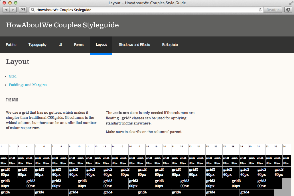
Increasingly, web designers of today also are developers — which is awesome. However, in my experience, most I’ve worked with have never touched code, and none expect to as a part of their day-to-day. For this and many other reasons, coded styleguides are a must.
The styleguide conversation’s not a new one — Anna Debenham, for instance, wrote about it last year for 24 Ways. I’m going to avoid trodden ground as best I can. Instead, I wanted to show how styleguides have helped myself and my coding and designing coworkers at HowAboutWe, and hopefully convince others to adopt them.
Styleguide as a Proof-of-Concept
My last project at HowAboutWe was the two-month inception of the HowAboutWe for Couples minimum-viable-product. By that point, we’d just started to build out an internal team of designers.
She was certain many headers and buttons would have to be cut images. It would be rocky between us if I couldn’t convince her of otherwise.
The designer in charge of Couples had a mixed relationship with developers in the past. She didn’t trust in the capabilities of modern browsers, especially with regards to rendering drop shadows and web fonts, despite leaning on both in her designs. She was certain many headers and buttons would have to be cut images. It would be rocky between us if I couldn’t convince her of otherwise.
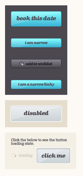
So on the engineering side, we set out to prove her wrong by incepting the HowAboutWe for Couples Styleguide, starting with buttons. And she was convinced.
Another fun thing I managed to convince her of that had even me a little suspicious was using a web font for all icons. And that’s the other useful thing about a styleguide — it’s a place, isolated from the other complex layers of implementation, to prove out ideas and hunches. A lab where things can be tried, evolve and change without too much difficulty. It could have been that the maintenance cost for a font icon or all-CSS buttons would have been too high; a styleguide is the place for figuring that out. (Spoiler: Both succeeded.)
For Onramping and Implementation Speed
Designers weren’t the only new folks at work. We’d also been recruiting developers at a fast clip. For these folks, our styleguide was also a crucial on-ramping tool. They could quickly grasp most all of our internal HTML and CSS coding and naming conventions, and could be prepared much sooner to contribute real work.
And delivering work is itself simplified. With modularized styles and markup centralized, organized, and presented in one place, the frontend for new features becomes a much simpler process. It can also be parallel-ized with confidence when developers have a styleguide to consult.
For Coding and Designing Authority
The styleguide should have the rule of law. If some design concept isn’t there, whether it’s at a high level like paginated navigation or much more granular like a font size, there should be a good reason to add it in — otherwise, whatever’s already in the styleguide should be used, instead, or the styleguide should be updated to the new design.
Clearly, it requires a special kind of discipline to enforce the styleguide so strictly — but in my experience, this level of tension between design and styleguide is important. On frontend teams with more than a few developers, nonchalance about (or complete lack of) a styleguide leads inevitably to massive bloat and redundant implementations.
…aggressive iteration without proper styleguide discipline (by both developers and designers) lead to a stylesheet so large that IE8 couldn’t parse it completely…
This was a lesson learned the hard way in the HowAboutWe dating site, where aggressive iteration without proper styleguide discipline (by both developers and designers) lead to a stylesheet so large that IE8 couldn’t parse it completely (though, that wasn’t the only symptom; inefficient use of sass also played a big role). Disciplined styleguide usage makes maintenance far easier, which increases developers’ and designers’ happiness.
To Help Finalize Design
No web designer of today should consider a design that only exists in
Photoshop as final. Things will look different in browsers, and
designers will want to tweak accordingly — slightly increasing
line-height, adjusting a color, or changing a
margin.
Additionally, few designers I’ve met have worked out user interactions in Photoshop. It’s something that needs to be seen in a browser before being settled. In HowAboutWe for Couples, the aforementioned buttons’ initial state was designed in a PSD, but interactive states like loading weren’t. Coding the styleguide was instrumental in working out those interactions, and many other kinks. Which leads cleanly to the next benefit…
For Easier Redesign
Having a styleguide in place means the broad UI concepts of the respective website have been worked out. And in turn, that makes the inevitable redesign much easier.
Naturally, not all concepts in a styleguide will survive a redesign. This could be an indication that those concepts were too specific and high-level in retrospect. But, in reality, the balance of what’s too high-level for the styleguide and what’s not depends on a lot of things. If the implementation of a particular component is reused often enough in designs, even if it’s fairly complex, then it deserves to be in the styleguide for developer ease. It’s one of the reasons the Couples styleguide has a boilerplate section.
Coupling to the App
One last departing bit on where the styleguide lives compared to the site(s) it’s for. I think it’s useful to have the styleguide point to the very same stylesheets of its corresponding site(s), which is what we did at HowAboutWe. By doing so, the app’s stylesheets are implemented with the styleguide. And in future maintenance, updates in one force developers to keep the other current, as well.
Conversely, it makes little sense to share HTML directly, since it’s
hard to separate HTML from content that isn’t relevant. Instead, denote
the relevant markup blocks in the styleguide somehow — we used HTML
comments in the Couples styleguide, only because we were too lazy to get
textareas with the relevant markup in them implemented.
12/13 Update —
Lenny Sirivong commented below
about a
bit of simple jQuery by
Dave Rupert that parses
for data-codeblock attributes and presents them as a pretty
string that can be easily copied. Good quick way to get code blocks from your
code demos!
In case you were wondering…
The HowAboutWe styleguides are implemented via the awesome static site
generator, Middleman,
which is like Jekyll,
but supports Haml for HTML,
Compass for CSS, and
CoffeeScript for JS.
They lived in subfolders within their respective Rails applications, and
spit out the compiled pages into /public to get served up outside
of the Rails stack.
In typical “me” fashion, this endorsement has been a long-winded, and I thank you for reading this far. I’d love to hear if and how styleguides have helped or hurt your own work, so please comment your thoughts!
Merry frontend-ing!

