Redesigned-ish
Been having the itch since the beginning of the year to make some changes to my year-old site design. So I worked on it on-and-off for several days, and launched it last week. In addition to some small clean-up, I’ve changed some fonts and colors. I’d barely want to call it a “redesign” at all, but there are some fun details I want to note.
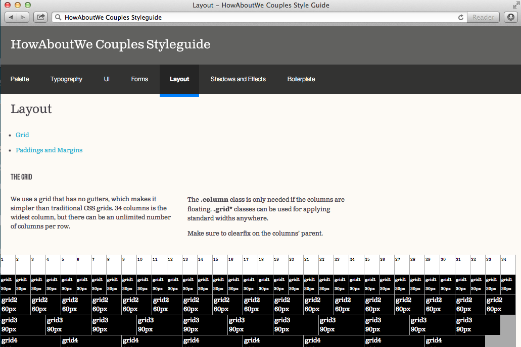
Trust In Styleguide

Increasingly, web designers of today also are developers — which is awesome. However, in my experience, most I’ve worked with have never touched code, and none expect to as a part of their day-to-day. For this and many other reasons, coded styleguides are a must.
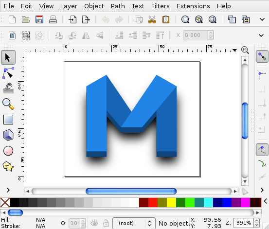
Futzing Around with Icon Fonts and SVG

Vector graphics are great. They deserve more of a place on websites than they get — certainly compared to their rasterized cousins. Nowhere is this more true than with icon UI. I decided to dip my toes into two leading solutions to bringing vectors to webpages: icon fonts, and SVG.
Regressive Enhancement at SXSWi 2011!
Just a quick one here, urging you to vote for the Regressive Enhancement, or Use HTML5 Today! panel for SXSWi 2011. Because I can find no better reason to go than to see a couple of friends of mine on stage. (Maybe the BBQ.) Also congrats to Mike Taylor, one of the speakers, for his brand spanking new gig at Opera!
